§ tl;dr
I led the end-to-end UX/UI redesign of Yanbal's B2B2C e-commerce platform (SAP Hybris), deployed across 4 LATAM markets. The work established the company's “% Autonomy” north star metric, lifted autonomous active users by 12%, and drove a 10% increase in average order value for those users.
01 context
Yanbal sells through a network of 500,000+ independent consultants. Their digital strategy needed a single e-commerce tool to serve all of them, but the platform had to absorb hundreds of country-specific business rules, promotions, and seller tiers while staying flexible enough to adapt per market. I joined to deliver this in six months, leading a team of three designers, and to define the metric that would measure whether it worked.
02 the interesting decision
Research before designing
With the deadline looming, the obvious move was to start designing flows immediately to cover the hundreds of edge cases. We chose the opposite. We invested early in in-person field research, traveling to interview consultants in Mexico City (the first market to adopt the tool), then Cusco, Lima, and Iquitos; deliberately spanning the Peruvian highlands, capital, and rainforest to understand radically different user contexts.
That research surfaced a distinction that became central to the whole project: autonomous users who used Yanbal's digital tools directly, versus non-autonomous users who depended on their directors to place orders. This framing later became the foundation for the north star metric.
It also caught a costly problem. Usability testing showed the feature meant to explain the “Ganamás” rewards program wasn't understood. We dug into the behavioral data and found that 17.8% of consultants in Peru were losing a rewards incentive simply because they didn't realize they were just short of earning it, a $440,000 annual opportunity hiding in a comprehension gap.
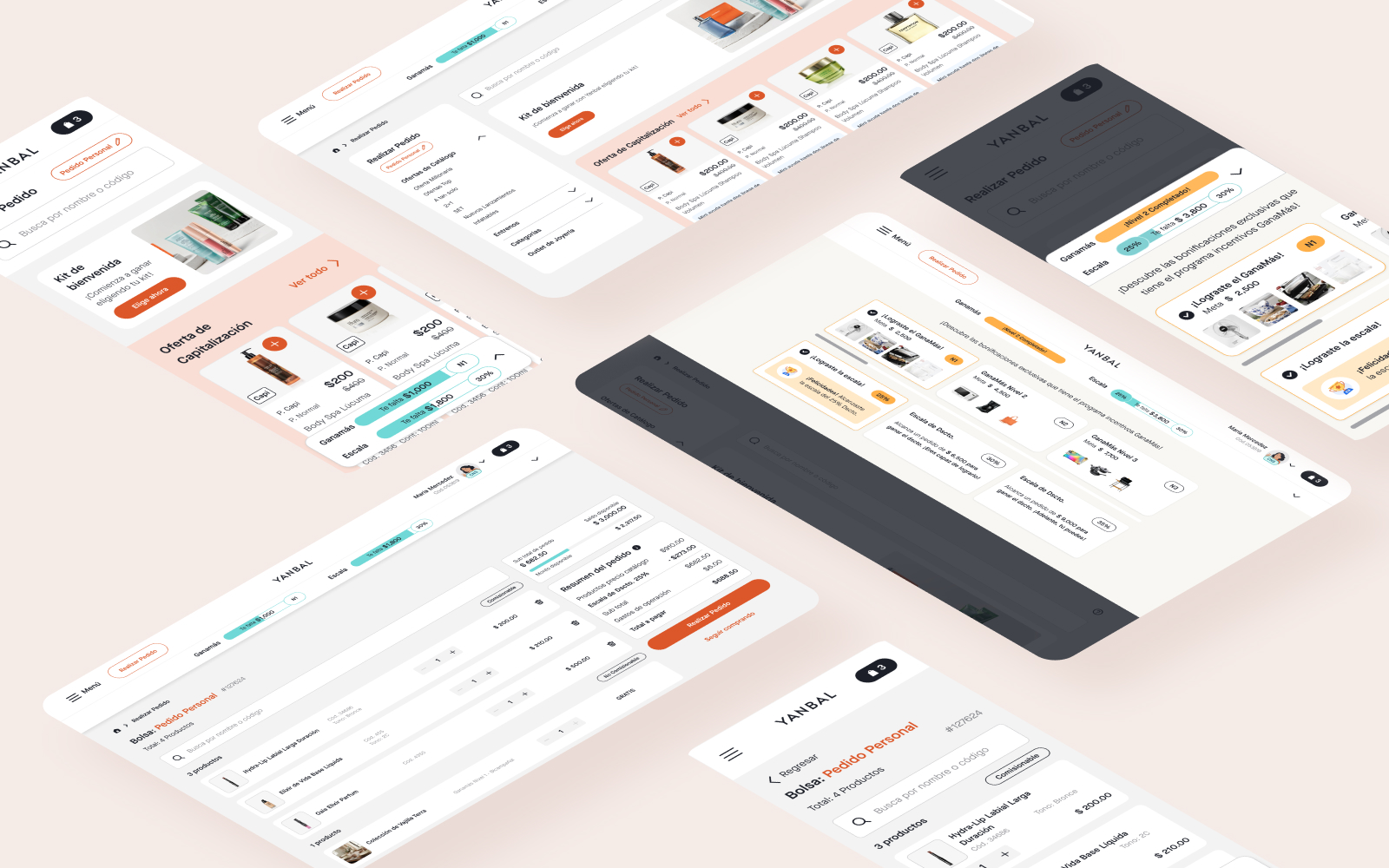
03 what shipped
Three screens, three decisions
Each screen below pairs the deliverable with the decision behind it. The annotated visuals are the heart of this case study.
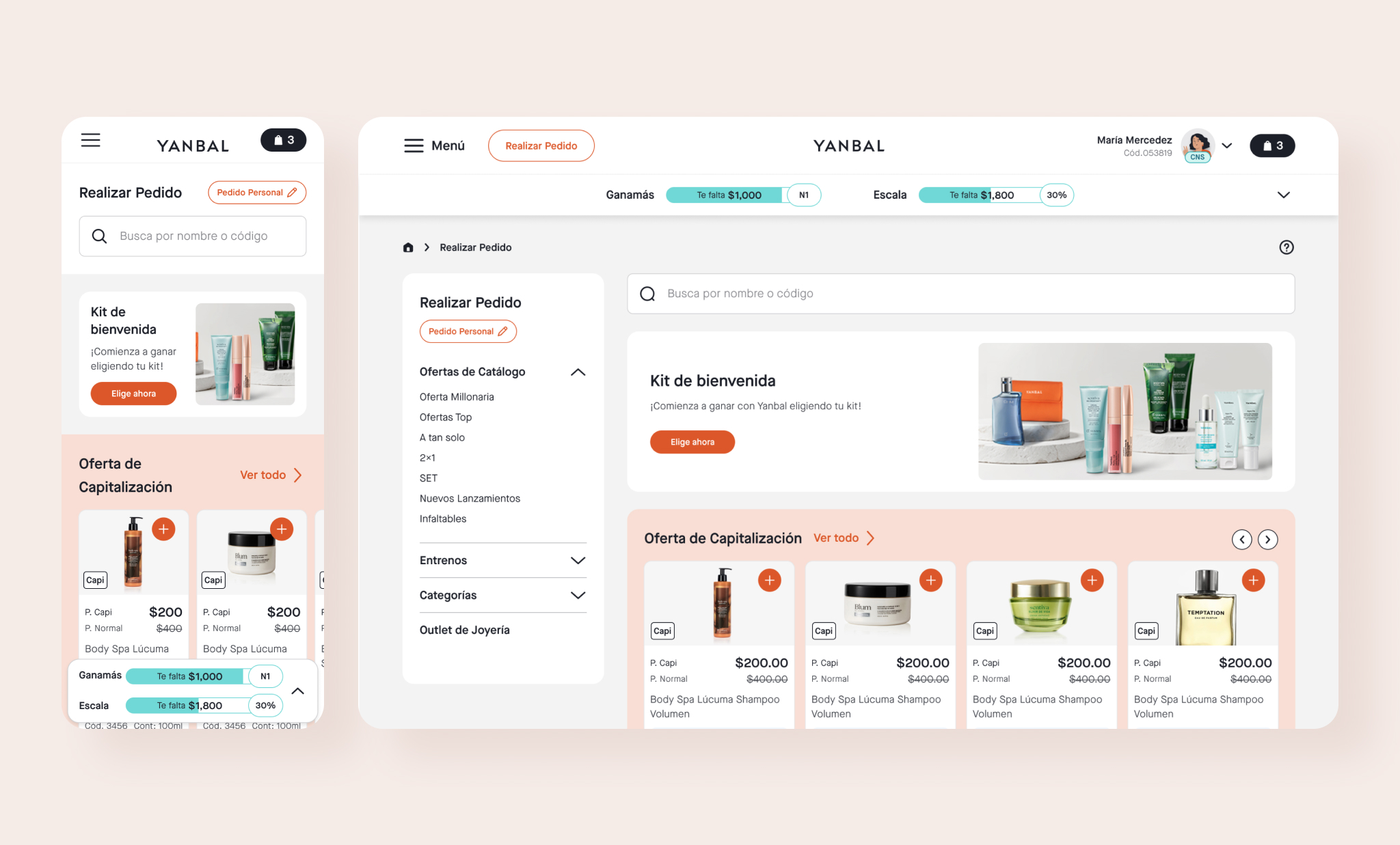
Surfacing business logic without burying the user
The home screen had to expose rewards status, active promotions, the welcome kit, and order-type config at once. We anchored the Ganamás and Escala progress bars to a persistent strip sticky on desktop, a bottom sheet on mobile, so a seller always knew how close she was to her next reward without leaving the buying flow.
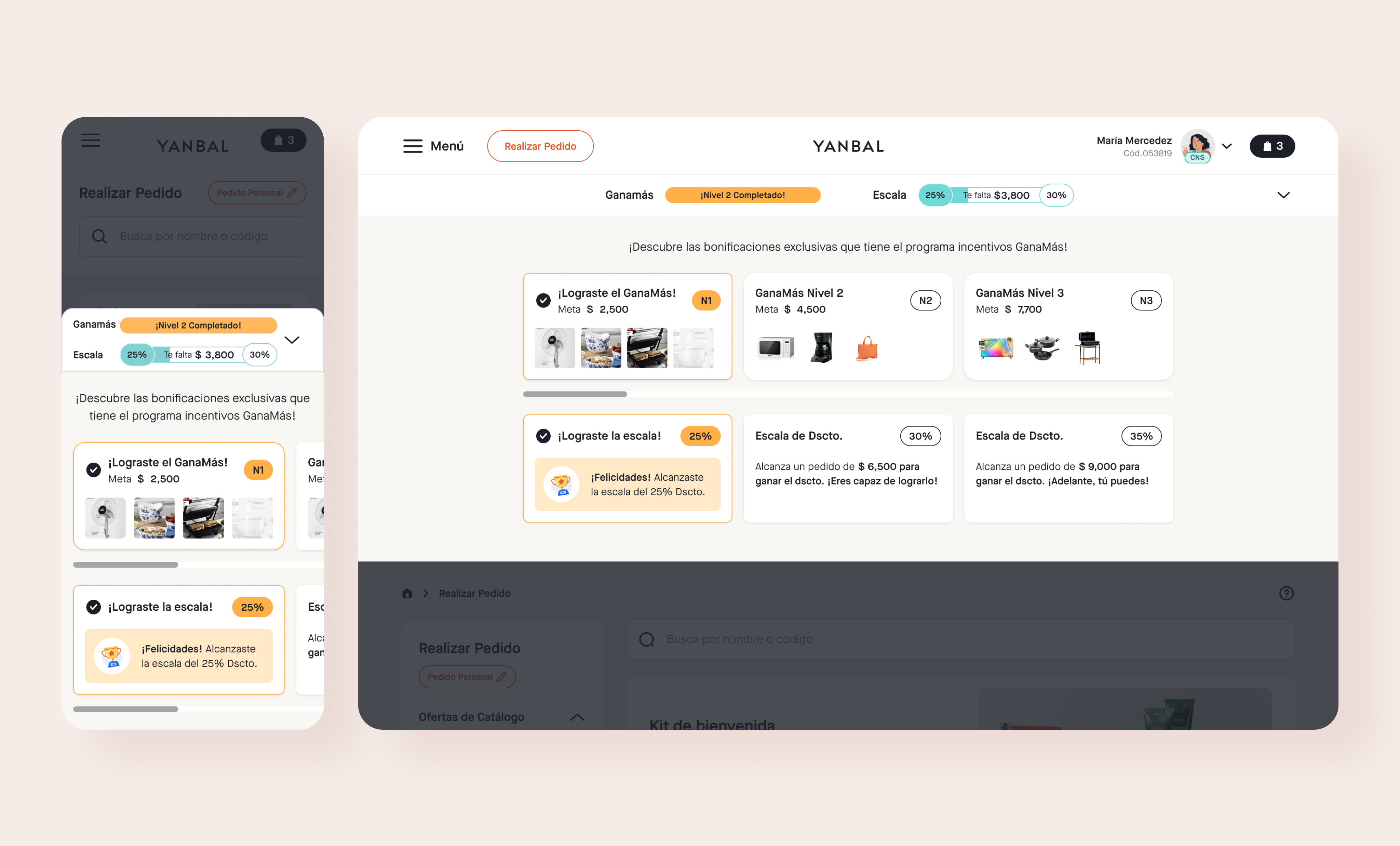
Turning a comprehension gap into clarity
Field testing showed sellers didn't realize when they were just short of a reward, a gap that cost Peruvian operations a $440K/year opportunity. We rebuilt the program as tiered cards that show the exact spend threshold and the specific reward it unlocks, with completed levels clearly marked and “you need $X more” framing on the next.
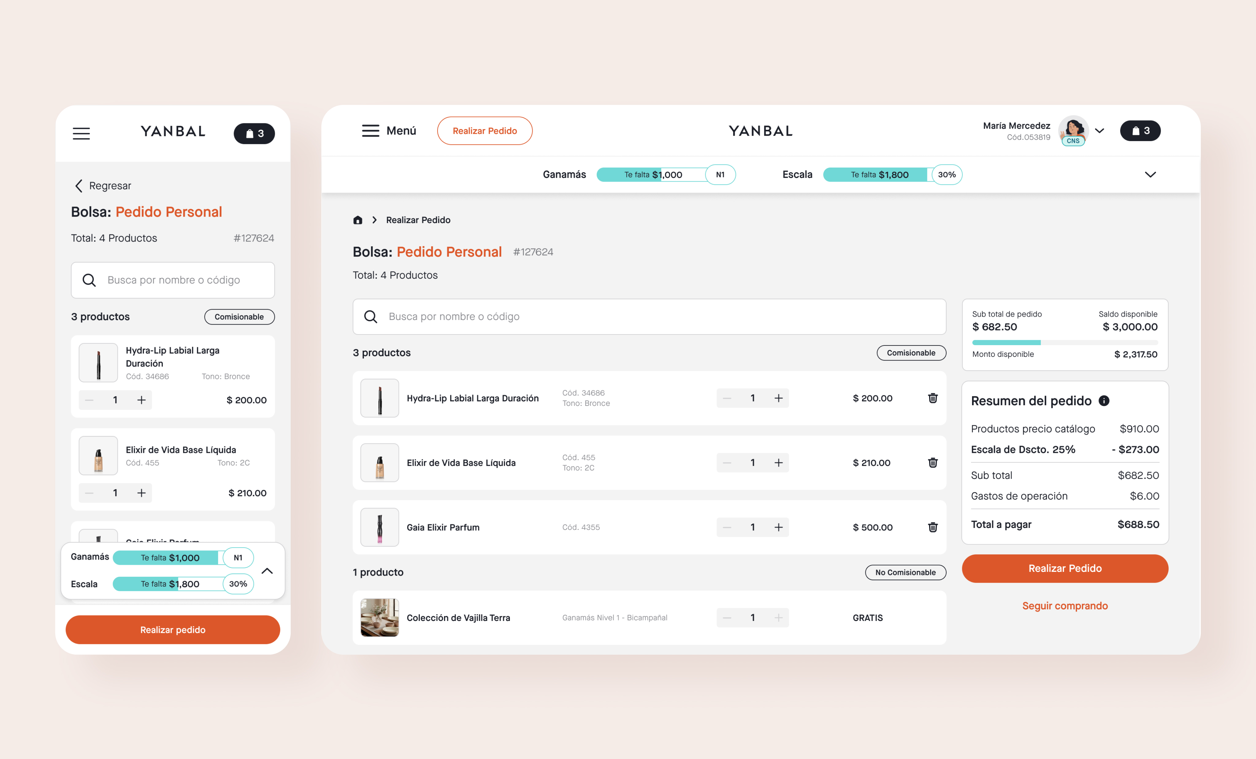
Designed around the platform's extreme users
Directors' assistants manage large, fast orders, so we added a search directly inside the cart to add products without browsing. The summary separates commissionable from non-commissionable items and breaks out tier discounts and costs, making earnings transparent for sellers who don't trust a black box total.
04 outcome
I led the qualitative and quantitative research behind Yanbal's “% Autonomy” north star metric — now the primary measure of e-commerce health across all LATAM markets. (Definition: of new autonomous users who reach order submission, what share stay autonomous over time.)
The redesign lifted autonomous active users by 12%, shifting behavior from director-dependent ordering toward self-service. That autonomy correlated with a 10% increase in average order value among active users.
05 reflection
Redesigning an entire shopping experience inside a 60 year old business meant continually discovering areas of opportunity we hadn't known existed, which kept pushing us to question our own assumptions. If I did it again, I'd start the autonomy research track earlier: that discovery turned out to be our most powerful tool for aligning with other teams, and we found it later than we should have.