§ tl;dr
I led the redesign of Favo's core shopping experience, merging the seller and buyer apps into one. By grounding the work in a discovery phase that revealed how customers actually bought, we grew daily active users from 10K to 35K+ and lifted session conversion from 7% to 14%, roughly 7× the Peruvian e-commerce average.
01 context
Favo is a social commerce startup connecting door-to-door sellers (“entrepreneurs”) with neighbors buying groceries, saving families money and giving sellers extra income. The company's main growth bet, a feature called Community Purchases, was stalling: only 12.9% of exposed sellers participated, and 41% of buyers bought only the promo item and never returned. Average order value and engagement among top sellers were sliding. I led the design team responsible for turning this around.
context note Before we could redesign, the team first migrated 100% of users onto the new app without hurting conversion, an engineering and PM effort I supported but don't claim as a design win.
02 the interesting decision
Stop optimizing the feature, find out who's actually buying
The obvious path was to keep iterating on Community Purchases: better rules, better UI. Instead, we ran a discovery phase to ask a more basic question: why weren't sellers participating? The answer reframed the entire problem.
Interviews and analytics revealed that ~30% of customers were buying without using the app at all. 17% of sellers had their clients' login credentials and were placing orders on their behalf, so the customer never even saw Community Purchases. For these sellers, the app wasn't a tool; it was friction. We'd been optimizing a feature for people who never touched it.
That insight changed the mandate: the real problem wasn't the campaign, it was app adoption. We segmented the customer base into four profiles, anchored by two archetypes we called Karen (25–45, digitally fluent) and Miluska (35–50, non-digital, lives in WhatsApp and Facebook), and rebuilt the experience around getting both into the app and keeping them there.
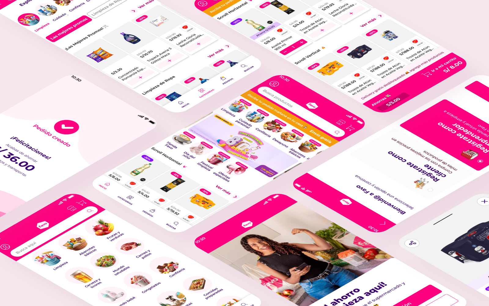
03 what shipped
Four initiatives, two in depth
The redesign produced four initiatives. The two below carried the most weight; the other two are noted at the end.
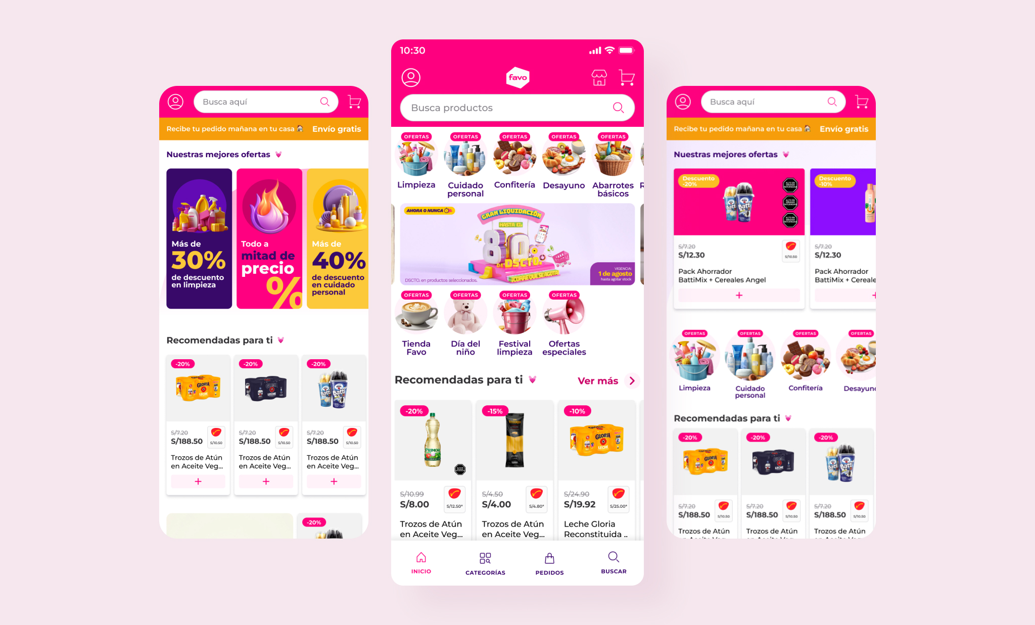
Personalized + restructured
70% of new customers never made a second purchase despite opening the app repeatedly. We hypothesized the home screen wasn't communicating Favo's core “cheapest prices” promise. An A/B/C/D test isolated the variables: a restructured home (+17% avg spend) and personalization (+17%) each helped, but combined they delivered +30% average spend, lifted scroll-to-bottom from 30% to 80%, and raised home conversion from 40% to 70%.
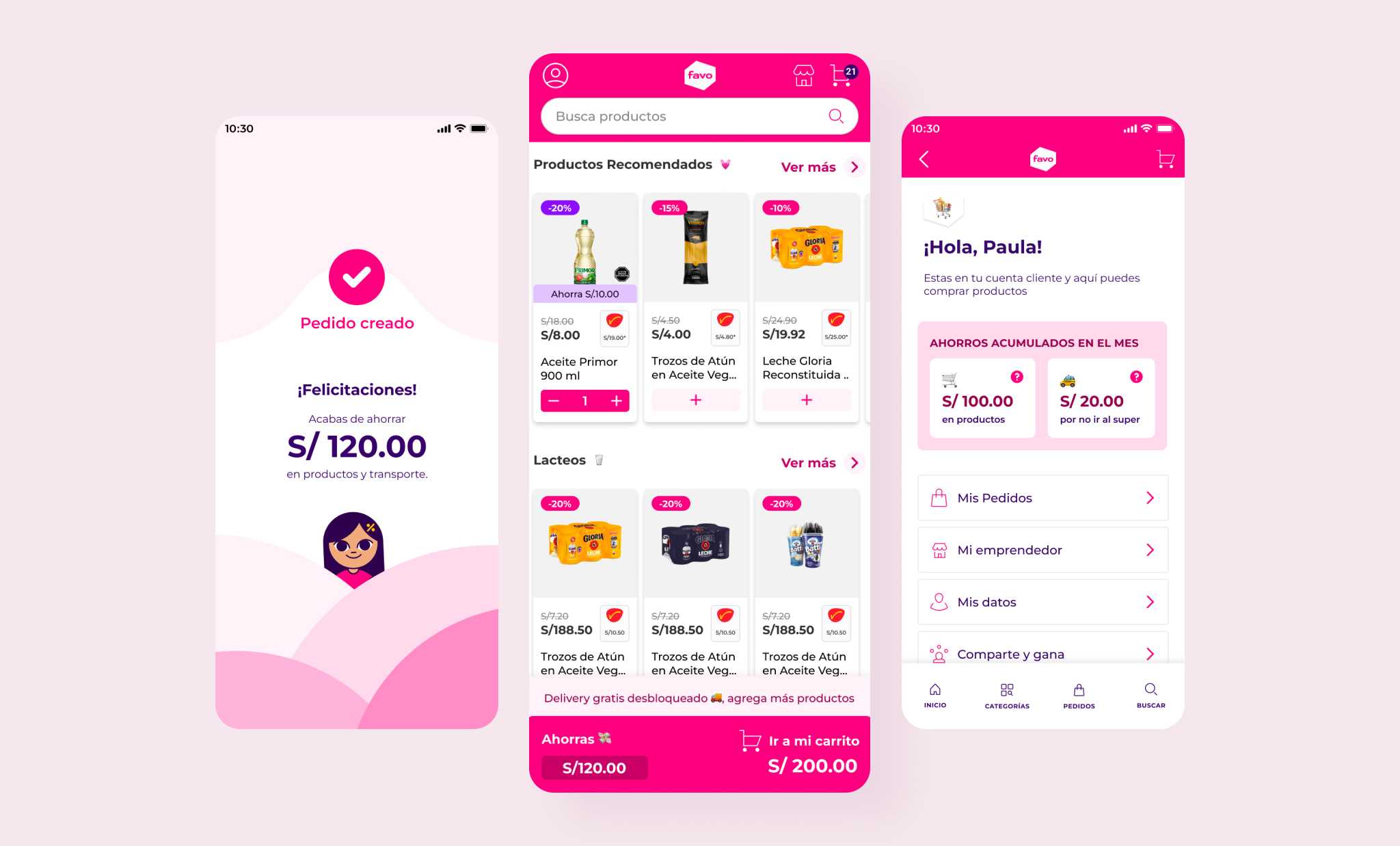
Visible savings as proof
For Favo's price sensitive customers, the app never actually showed how much they were saving. We surfaced savings, and community savings as social proof, at home, cart, and checkout. A/B/C testing on placement and treatment drove a +25% lift in retention.
- Simplified first-purchase flow +30% end-to-end first-purchase conversion, designed for Miluska's non-digital profile.
- Personalized pricing for new customers +14% first-purchase conversion, 1.7× new customers, sub-$5 CAC.
04 outcome
Daily active users grew from 10K (Mar 2023) to 35K+ (Feb 2024). Session level conversion rose from 7% to 14% in six months, against a 1–2% Peruvian e-commerce average. I also established Favo's first scalable UI kit, standardizing the visual language and accelerating design-to-dev handoff.
05 reflection
The biggest lesson was how close we came to solving the wrong problem. We were a discovery phase away from spending months optimizing a feature for users who would never see it. If I did it again, I'd push for that segmentation research before the growth roadmap was set, not after; it would have reordered our priorities from day one.